Homepage
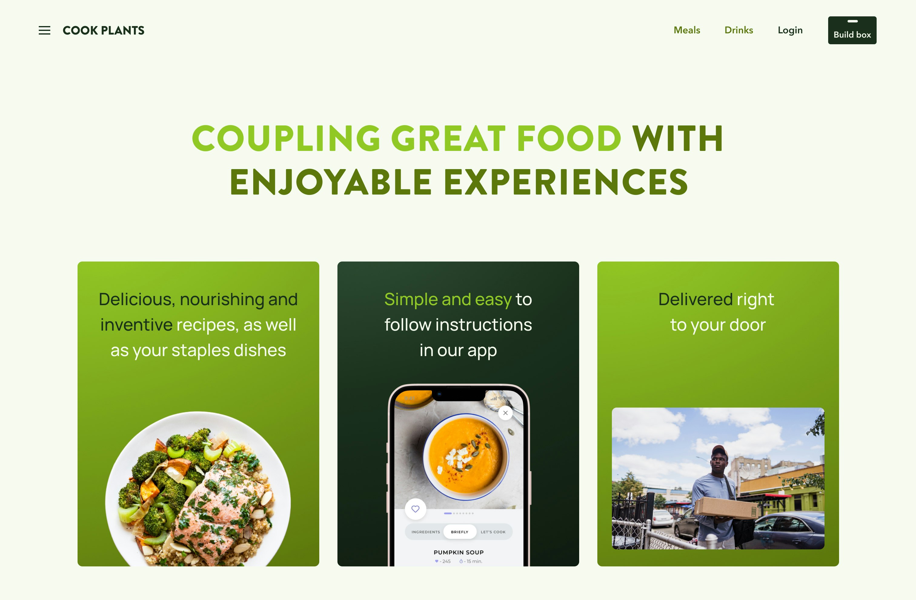
The homepage for Cook Plants had to capture attention and instantly give the user an understanding of what the business is all about, even though the name says it all. We keep things super straightforward and focused on providing a rememberable message, with two important CTA’s which push the user to understand more and begin their shopping experience.
Basket
For the basket, we needed to ensure this was highly functional and provide users the opportunity to change their selections, add or remove portions and be able to change their box size. Whilst also providing an indication as to how many items they need to complete their box. We loved this challenge and we love the exploration Cook Plants chose to take off with.
Menu
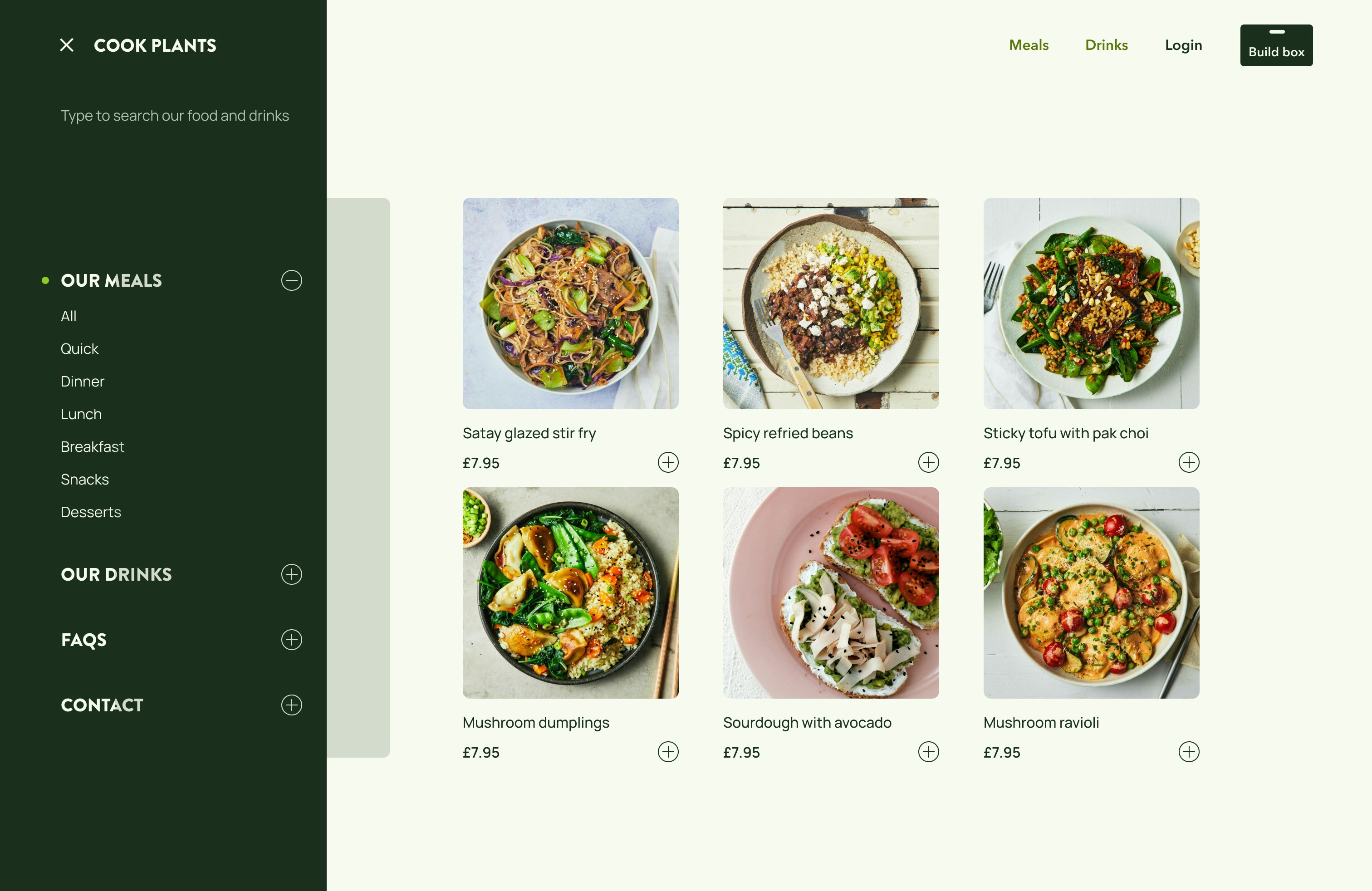
Our focus for the menu was to keep things easy for the user, we incorporated a search bar for users who wanted to get to a recipe or something they had in mind quickly. We used a clear to + - to highlight the active tab to the user an approach which allowed the user to expand or minimise their selection and find what they were looking for with ease.


